Before worrying about your logo you should concern yourself more about your overall web design. It does not look professional or polished. One major point of contention for me is that no matter which link you choose on the page you are always presented with the same huge banner and have to scroll down to see the chosen subject matter. All those links might be moved to a single menu pull down, a side frame or, better yet, a small top banner with each link bringing the subject to the fore. That background color reminds me of Pepto-Bismol and nausea so you might consider a change along with the fonts and layout. And what’s up with the “AI Assistant”? It seems non-functional and unnecessary. I suggest consulting with some of the webdevs here (IIRC the old DSLR had a forum just for that) or on Reddit.
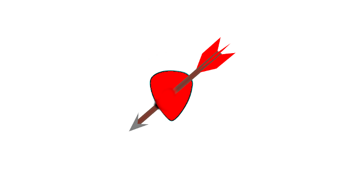
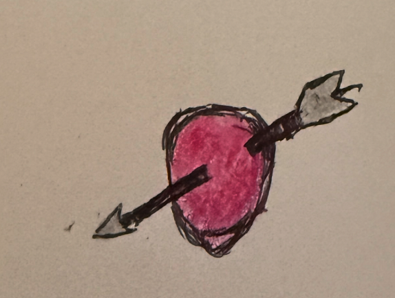
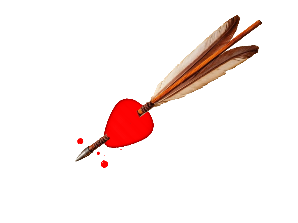
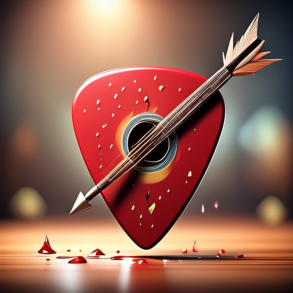
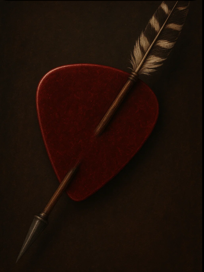
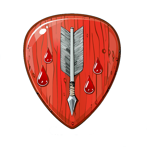
As for the logo, it should represent your love of guitar picks - I’m not certain that an arrow piercing a pick conveys that message. To me it looks like someone shot a flaming arrow through a valentine’s heart. Maybe change the colors, maybe have a pick surrounded by (on top of) a heart, maybe Cupid playing a lyre with a pick or maybe just a pick with a stylized “PF”. Also, the logo should be placed at the top left of every page.
I’m not saying any of this to be mean, just to give you an honest critique.